- Published on
Visualizing Data From the MapMyFitness API
- Authors
- Name
- Justin Kelly
- @JustinHKelly


Note: The API referenced in this article has been deprecated.
I've been using the MapMyRun app for iOS for a while now and so far it has been great (aside from the endless nagging to sign up for an MVP account). There are plenty of great running apps out there but the reason I went with this one is because they have an API that you can use to pull the data you collect from the app. I thought it would be fun to create some custom visualizations for this data using the HighCharts JavaScript library for graphs, and the Google Maps JavaScript API to create a map.
You can go here to get started with the API. Once you get signed up they have a nice tool that you can use to test the API and pull back real data.
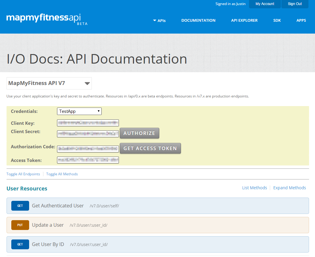
Here is what the tool looks like:

The idea of this demo is to show you how to create the visualizations rather than showing you how to use an API from within your app. So, we will be using this tool to pull back the data. For this demo we will be using the data from one workout.
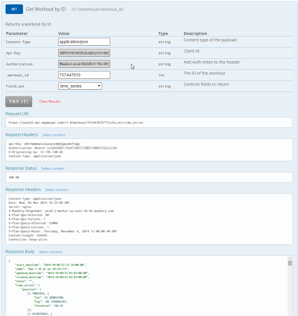
Here is a screenshot of the tool in action:

Now that we have the data we can move on to the fun part. We are going to create a graph that displays the speed and elevation during the run which should give us a good idea of how elevation changes impact our speed. We are also going to create a map that has our course drawn on it. Note: you will need your own Google Maps JavaScript API key which you can get here. Here is the code with comments to explain what is going on:
The finished product looks like this:

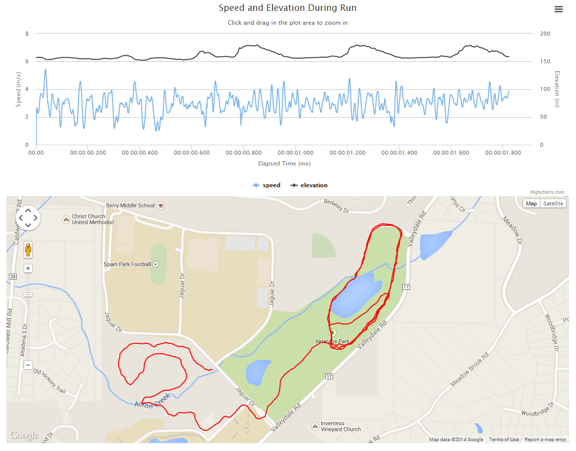
You can view a live demo here. Try dragging the yellow guy onto the map to check out the street view.
Of course you can just sign up for a MapMyRun MVP account and see these visualizations and more, but where would be the fun in that? I hope you have enjoyed learning about these APIs and the cool stuff you can do with them.